Delectable
Simplifying dining searches by delivering essential upfront information — eliminating the time and effort typically spent on finding these details.
Project Background
01
This mobile app project was one of my first introductions to User Experience Design. As a school assignment we were tasked to create a solution in the form of an app to solve the issues we felt that current apps in the market weren’t addressing. This was a solo project and I was responsible for the whole end-to-end process.
Info
02
Role
UX/UI Designer
Timeline
12 weeks
Tools
Figma
Team
Project Overview
Solo!
03
Problem
Students were struggling to find affordable restaurants or restaurants that considered the many different dietary restrictions and needs in their urban city, in turn causing them to have to sacrifice their standards.
Solution
I created a platform that would allow users to see all the information they need about a new restaurant accessible. Prioritizing the small things that get over looked but greatly matter.
Origin
As a new student in Downtown Toronto, known for its diverse food scene, I found it intriguing yet overwhelming to decide where to eat. Typical search engines often lacked easily accessible information about restaurants, forcing me to dig through reviews and photos on multiple platforms to check if a restaurant met my dietary needs and price ranges amongst many other things.
Curious if other students shared this frustration, I conducted research through my school's Reddit forum and conversations with friends and classmates. I discovered that many faced the same issue. So, when an assignment required creating an app to solve a problem, this idea naturally came to mind.
💭
🤔
Initial Research
Since I was among those who could be significantly affected by this problem, I discussed it with classmates and peers. I also used the TMU subreddit to see if others had questions about food places around campus. This allowed me to see a diverse set of answers from all types of people with different needs and priorites when it came to restaurant searching. I found that many shared the same frustrations and desired more detailed information about dining options
Several Reddit threads highlighted and confirmed the issues students encountered (retrieved 2020)
Defining the Problem
Through the initial research process, I confirmed my belief that many people were indeed facing challenges on choosing food places that catered to their needs. When it came to choosing a restaurant to eat they were influenced by either; affordability, location, dietary needs, etc. This led me to this question :
How might we eliminate the hassle of searching for dining options by providing all the necessary information in one place?
Since this was an introduction to mobile app design, we were advised to look at other platforms that were doing the similar objectives that we had in mind for our solution. Because my idea was in the food/restaurant realm I chose OpenTable.
I conducted an app review a through app review that you can find linked here.
Competitor Analysis
What did I find?
At the time of this project OpenTable’s main weaknesses included:
Limited Restaurant Variety: Mostly features pricier spots, with few affordable or casual options.
Reservation-Centric: Focuses on restaurants with booking systems, leaving out smaller, local places.
Lack of Practical Details: Missing information on dietary options, dress codes, payment types, and accessibility features.
No User-Generated Content: Lacks user-uploaded food photos, missing out on community-driven appeal.
I did shadowing and conducted user interviews to gain insights into the daily activities and needs of potential users when it comes to eating out locally or even far.
I carefully crafted questions that would elicit meaningful responses from participants. Through these interviews, I was able to gather both qualitative and quantitative data on users' behaviors, attitudes, preferences, and pain points. I recorded the interviews and created a video to capture the key insights and learnings that emerged from the interviews.
This video allowed me to easily reference the user feedback as I began designing the app screens for the project. By leveraging the insights gleaned from user research, I was able to create a user-centered design that addressed users' needs and preferences, resulting in a more effective and engaging app.
Here are some of the questions I asked the general “target user”.
Understanding the User
Empathize / Researching
My intended users were students so I was able to get some people to gather research from for the feasibility of my idea on campus.
I spoke with three students to observe their process of trying new food places in the area. Additionally, I interviewed them to discuss their motivations and pain points regarding their experiences with other platforms and food searching in general.
The three key priorities I found with them was:
Price
Accessbility
Alternative Food Options Offerings
Define - User Portfolios
I analyzed user feedback to create profiles highlighting the key wants and needs of my target audience when dining out. These profiles distilled user feedback into clear, actionable insights to guide app design.
By identifying patterns and trends amongst the answers, I informed the most valuable features and functionalities for the target audience. This helped prioritize design features that would significantly impact user engagement and satisfaction.
I documented their motivations, goals, and pain points, including meaningful quotes to reference during the design process
Reflecting and Next Steps
After speaking with people with diverse backgrounds, I learned what mattered to them and thay informed me on things that would matter to users and I took that to apply to my design thinking solution.
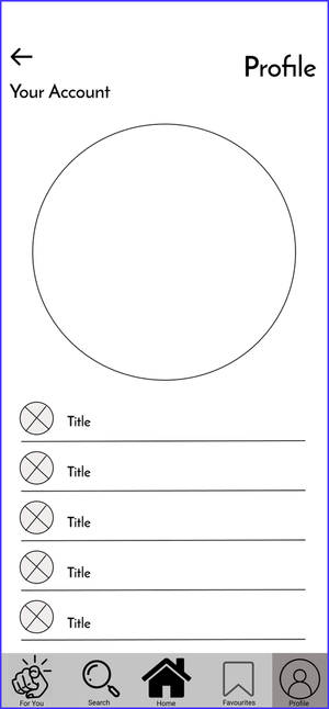
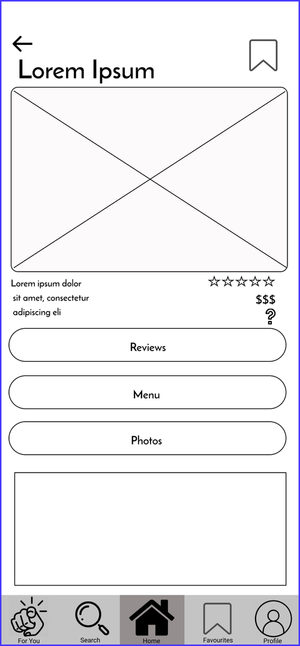
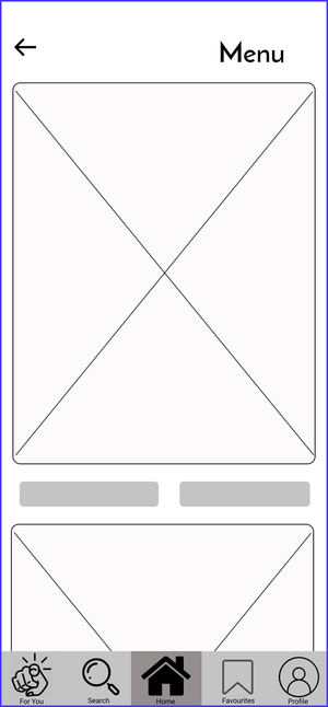
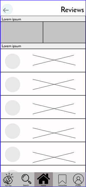
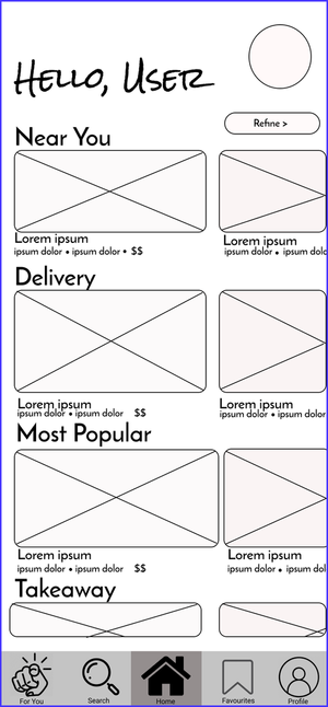
I created a low-fidelity prototype of the app and included the main features. What I found that they valued from their feedback was creating a feature for pricing, accessibility info, and alternative food being an easily accessible piece of information. I created the wireframes first, then created user scenarios that each user may run into. Essentially a user flow with their individual scenarios in mind. This was the first iteration of the app wireframe.
Wireframing + Prototyping
I created potential scenarios that users might face when using the app, based on the motivations and goals of the people I interviewed. These scenarios helped me to identify the specific features and functionalities that would be most useful in solving the problems that users might encounter. By testing these scenarios and observing users as they interacted with the app, I was able to identify potential pain points and refine the design of the app accordingly.
These user scenarios proved to be a valuable tool in the UX design process, helping me to ensure that the app was user-friendly and effective in meeting the needs of users. Based on my research and testing, Delectable is a promising product for potential users, as it offers a range of features that address the pain points and preferences of the target audience. Through the use of user scenarios and other user research techniques, I was able to create a design that is intuitive, accessible, and efficient, delivering a positive user experience that meets the goals of users.
Determining Usability & User Scenarios
1st Iteration
This was the initial design of the Delectable after I had gone through user interviews, journeys, and scenarios.
This app was designed with the feedback of users in mind and solving their problems that were addressed during the research phase.
Solutions that were aimed to be solved with this design
1) Page
2) Features
3) Questions
I tested with 3 testers, and gave them a usability questionnaire that required them to find different features in the app so I could test the functionality and if those main features I needed them to get access to were clear. I received very useful feedback and the main thing was to make sure the detail feature was clear.
A main task that I assigned to the users was to locate the details tab that included those small details that other apps failed to include at the time.
Testing + Feedback
So many things I wish I could research about a restaurant are in this app and it’s something that more people are going to use aside from Google or Yelp!”
“There is no button, no indication anywhere that leads to the page. Do I have to click on the picture? Do I have to click on the question mark? I’m thinking it might be the question mark but the icon is really small therefore I did not notice it at first!”
“I could not figure out how to access the details page. Maybe have the question mark symbol bigger or have it as a button with the menu, photos and reviews buttons.
Final Designs
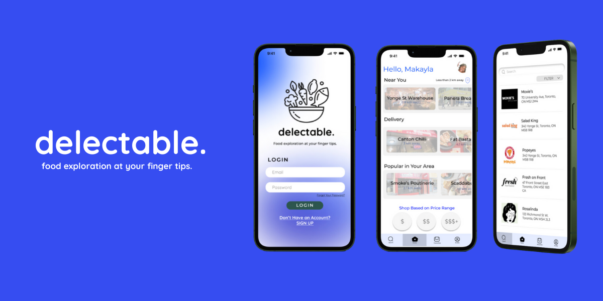
Following a thorough review and multiple rounds of revision, I implemented substantial changes to the interface design, taking into account the valuable feedback received. This effort culminated in the development of a brand-new, enhanced version that addresses key usability and user experience concerns. Hence the final design.
After testing and feedback, I made key updates:
Modernized Interface: Updated the app with a cleaner, more intuitive look.
Enhanced Access to Details Page: Made the details page more accessible by enlarging the button for easier navigation.
Removed Redundant Page: Streamlined the user experience by eliminating unnecessary steps.
Consistent Design Patterns: Applied uniform styles throughout for a polished, cohesive feel.
These changes were guided by real user feedback and helped create a more seamless, user-friendly app experience.
I learned a great deal from this assignment and the entire process. It served as an introduction to several key areas in UX/UI design, giving me hands-on experience in research, design, wireframing, and testing. Each phase provided valuable insights into how the design process comes together and how each element impacts the user experience. Through research, I was able to understand the needs and pain points of users, which directly influenced my design decisions. Wireframing helped me visualize and iterate on ideas quickly, and testing allowed me to refine those ideas based on real feedback.
This project really opened my eyes to the passion I have for UX/UI design. Seeing how thoughtful design can solve real problems and enhance user experiences was incredibly rewarding. It solidified my interest in the field and deepened my commitment to improving my skills as I continue to explore and grow in this craft.
Key Findings
Looking back, what would I do differently?
Looking back years later as a more developed designer, I would approach this project differently in a few ways:
Refine User Research: I’d spend more time conducting in-depth user interviews and surveys to gather broader insights, exploring different demographics and pain points.
Iterate More Frequently: I would embrace a more agile approach, testing designs and iterating faster to continuously improve the user experience based on feedback.
Expand Testing Groups: I would include more diverse user groups to ensure my designs cater to a wider range of needs and preferences.
Check out my RealOnes case study


